Upperroom
Upperroom: designed to brand a community ticketing platform, then build the site, organizer view and scanner that run on it
- Industry
- Church & Community Events
- Project timeline
- May 2026
- What we did
- Brand Strategy, Research, UI/UX Design, Design System, Prototype, Development, Ops
- Design deliverables
- Brand Identity, Event Website UI, Organizer Dashboard UI, QR Scanner UI, Design System
- Engineering deliverables
- Event Website, Ticketing System, E-Commerce, Organizer Dashboard, QR Scan, Payment System, SEO, Analytics
We gave Upperroom, a ticketing platform for church communities, one identity and one product, from the group chat where an event is shared to the door where it begins.
Events were planned in chats, paid by bank transfer and checked against a printed list on the night, so every guest and every volunteer started with a question.
Now the price sits on the first screen, every ticket carries a name and a QR, and any volunteer phone can tell who has arrived.
Objective
Design a brand that feels like the room where people meet, then build the event website, organizer view and door scanner that carry it from checkout to check-in.
The Challenge
Ticketing that speaks like a box office
Generic ticketing brands feel cold to a community. Upperroom needed a voice and a look that belong to a gathering, not a concert.
Three questions on a phone
Most people open the link on a phone and want when, where and how much. Many buy for a spouse or a small group, all in one go.
A printed list at the door
Volunteers matched guests against bank transfers on paper. That meant queues, awkward questions and no clear count of who had arrived.
The Solution
Two rooms that overlap
The organizers and the people who come meet in the middle. That overlap is the mark, and it becomes the double O in the wordmark.
One straight path to a QR
Price on the first screen, a name on every ticket, then QRIS with the tickets held for ten minutes.
Live numbers for the team
Revenue, seats left and live check-ins up front. Any phone becomes a scanner that answers in plain words.
Our development process.
Five phases in one month, from the first interviews with organizers to the website, ticketing, payments and QR scanner tested on real phones.
Part 1 · Brand identity
Community events are planned in group chats, so the identity had to feel like the room where people meet, not a concert ticket.
Two rooms, one overlap.
The organizers and the people who come. The space they share is the event itself, and it becomes the double O in the name.
Guidelines a growing team can follow.
Values and voice first, then the colour pairs and the type scale every new screen or poster reuses.
- Clarity
- Every interaction stays simple and direct, from finding an event to the ticket confirmation.
- Reliability
- Trust comes from clear information, secure tickets and the same flow every time.
- Community
- We design for people, gatherings and the experiences they share.
- Efficiency
- Less manual work for organizers, from event setup to tickets and check-in.
- Clear
- Simple words that tell people exactly what to do next.
- Helpful
- We guide organizers and guests through each step without making it feel complicated.
- Direct
- No extra wording, just the action: create, share, register, pay, check in.
- Calm
- Reassuring, above all during registration, payment and ticket confirmation.
- 64 px One room. Three nights.
- 48 px Tickets and pricing
- 36 px Harvest Night 2026
- 24 px 3-Day Pass · 13–15 Nov
Part 2 · Website, organizer and scanner
One straight path from the event page to a QR, and an organizer view and scanner volunteers run from their own phones.
Night colours, one clear action.
Navy sets the evening, one blue marks every step toward a ticket, and Inter keeps prices and seat counts easy to read.
Inter
Aa Bb Cc Dd Ee Ff Gg Hh Ii Jj Kk Ll Mm Nn Oo Pp Qq Rr Ss Tt Uu Vv Ww Xx Yy Zz
0 1 2 3 4 5 6 7 8 9 & * @ ? ! / + ( , . : ; )
- Regular
- Medium
- Semibold
- Bold
One family: body, labels, headings and ticket numbers.
Upperroom blue
- HEX
- #1B60FB
- RGB
- 27 | 96 | 251
- CMYK
- 89 | 62 | 0 | 2
Sky
- HEX
- #33BBFE
- RGB
- 51 | 187 | 254
- CMYK
- 80 | 26 | 0 | 0
Success
- HEX
- #4ADE80
- RGB
- 74 | 222 | 128
- CMYK
- 67 | 0 | 42 | 13
Error
- HEX
- #FF8A8A
- RGB
- 255 | 138 | 138
- CMYK
- 0 | 46 | 46 | 0
Navy
- HEX
- #000A13
- RGB
- 0 | 10 | 19
- CMYK
- 100 | 47 | 0 | 93
Surface
- HEX
- #0A1522
- RGB
- 10 | 21 | 34
- CMYK
- 71 | 38 | 0 | 87
Surface 2
- HEX
- #14212F
- RGB
- 20 | 33 | 47
- CMYK
- 57 | 30 | 0 | 82
Muted
- HEX
- #A3AEBC
- RGB
- 163 | 174 | 188
- CMYK
- 13 | 7 | 0 | 26
Off-white
- HEX
- #F7F9FF
- RGB
- 247 | 249 | 255
- CMYK
- 3 | 2 | 0 | 0
/Icons · 18 from the product, Remix line
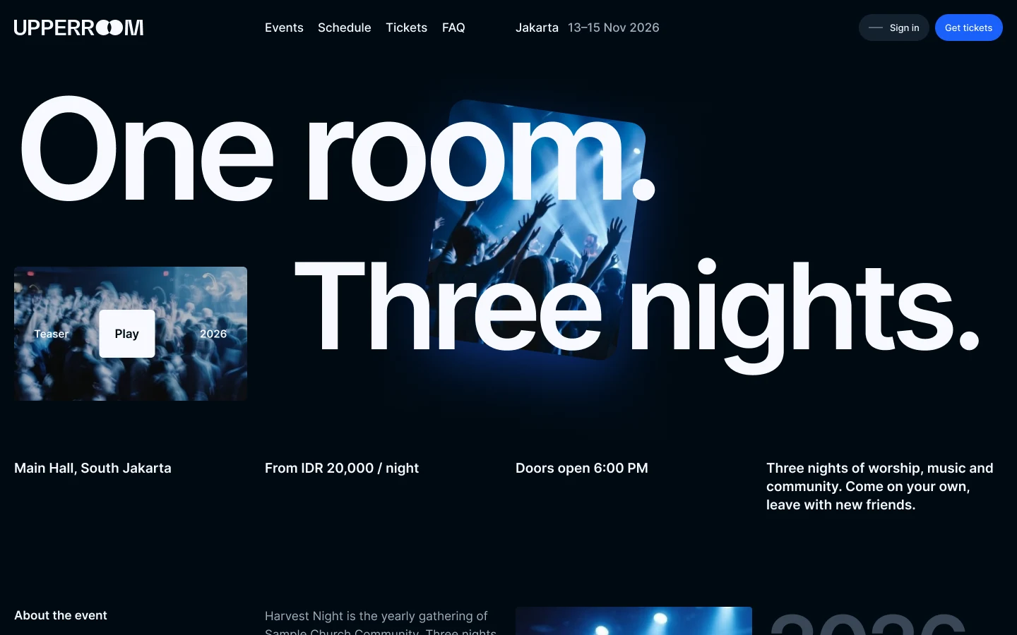
A homepage built like an event poster.
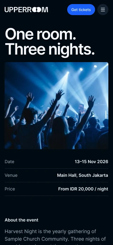
Here you see the full homepage on desktop and phone. It covers what the event is, who is on stage each night, ticket prices and how to get there.
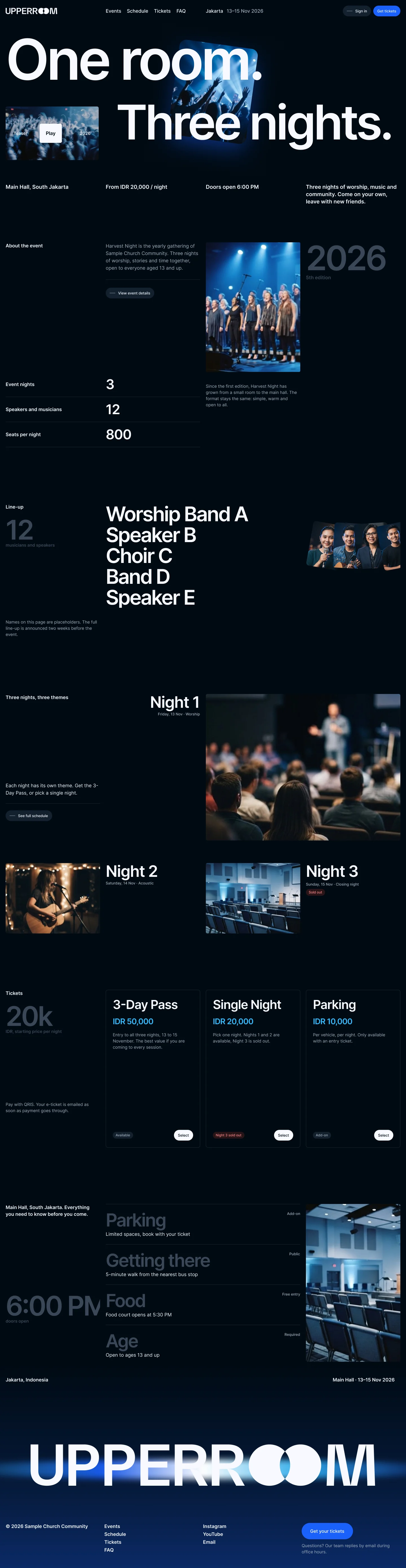

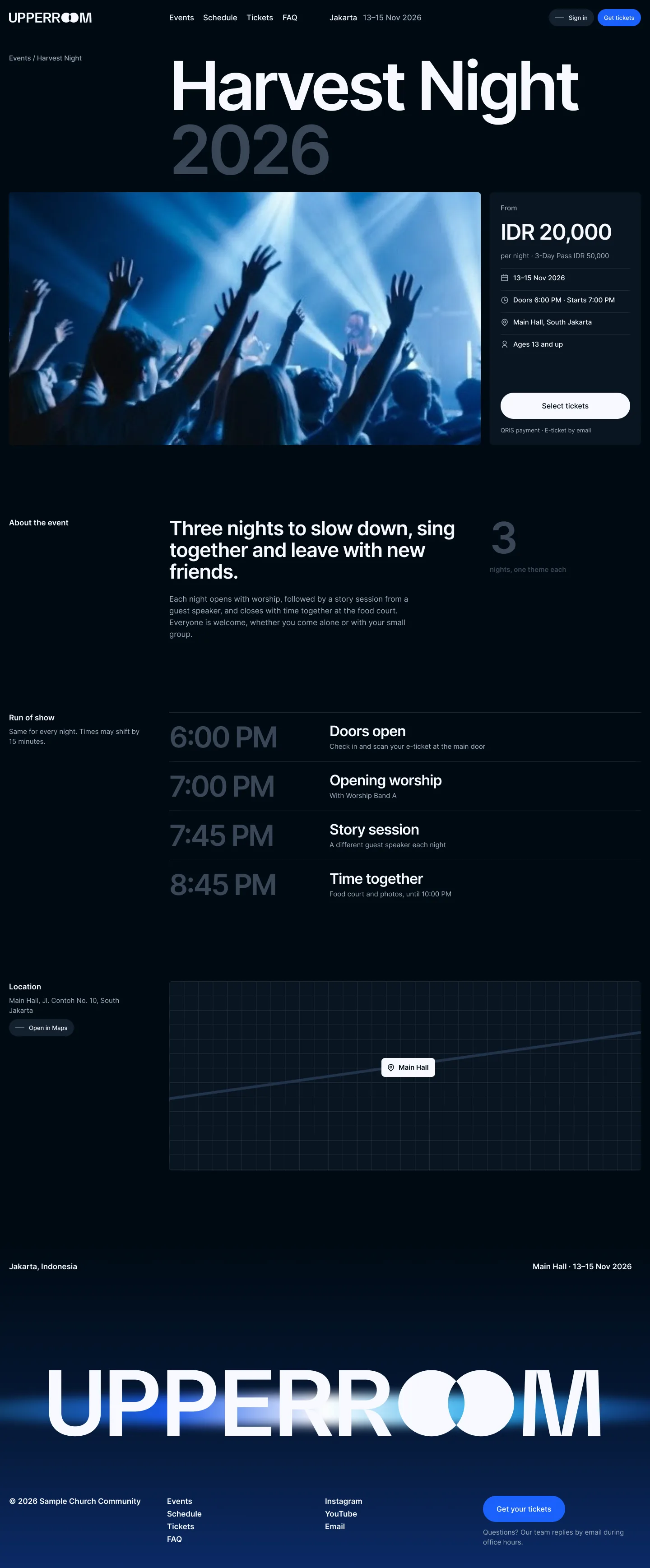
Every answer above the fold.
The event page puts price, dates, doors and venue in the first screen, because that is what people check first. The line-up and the questions guests ask follow below.
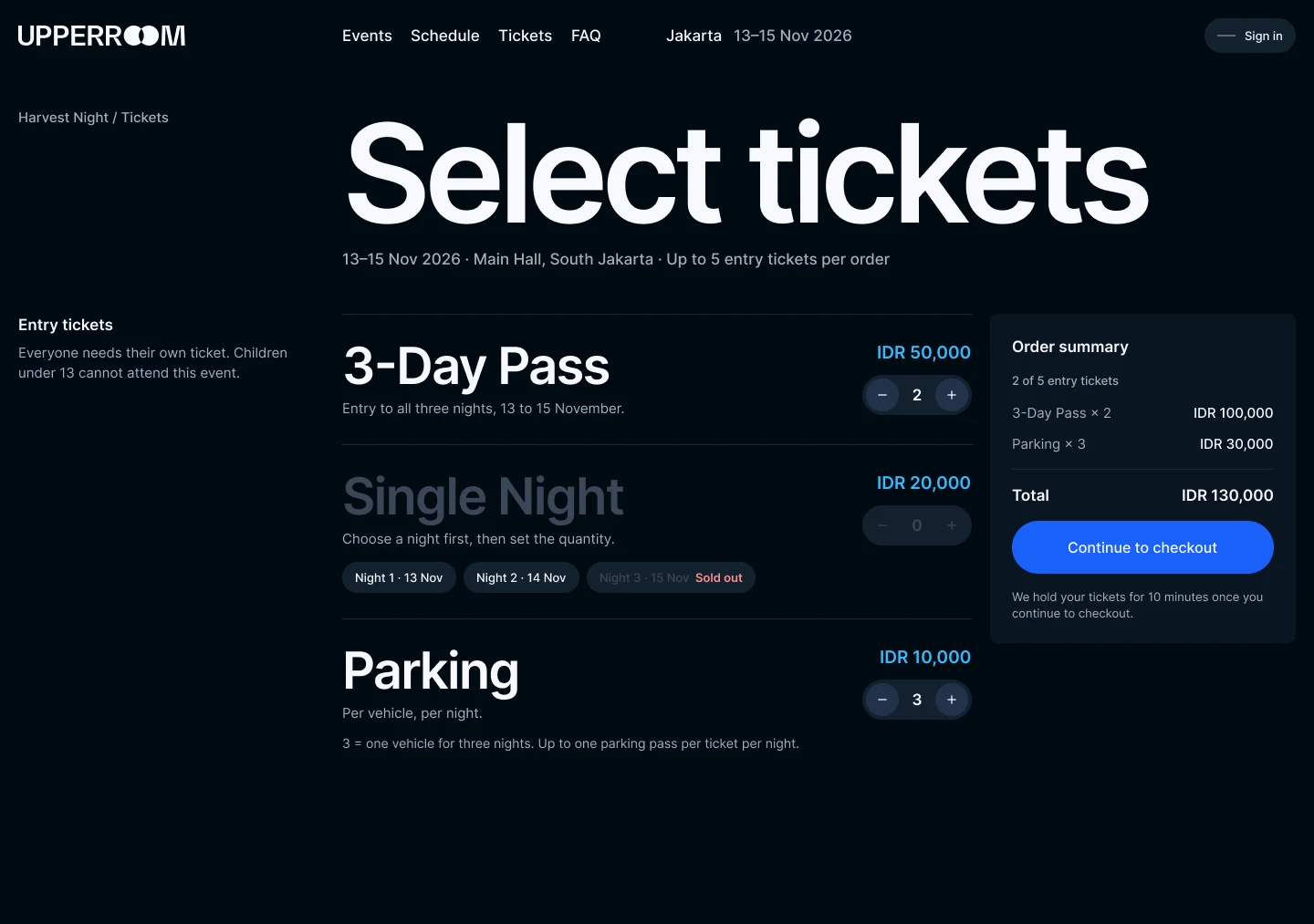
Tickets for the whole group
A 3-Day Pass, single nights or parking, up to five entry tickets in one order.
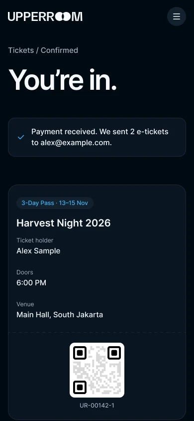
Every ticket gets a name, so friends can arrive on their own.
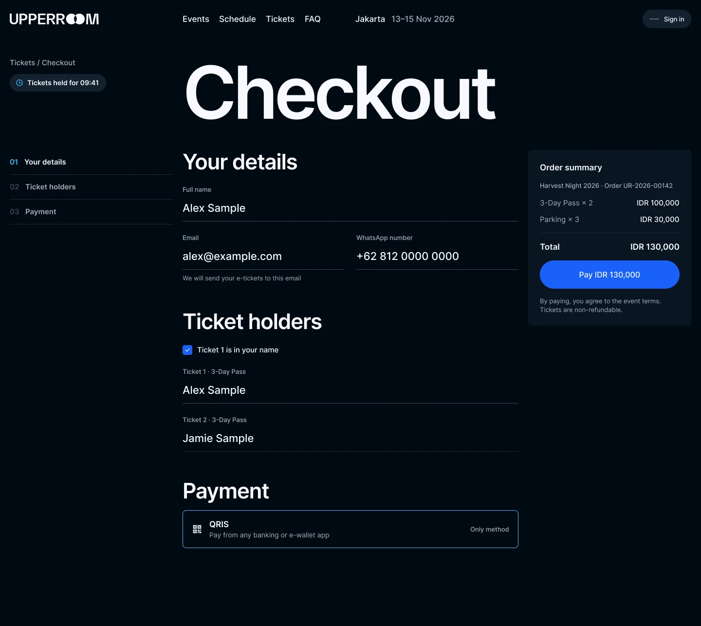
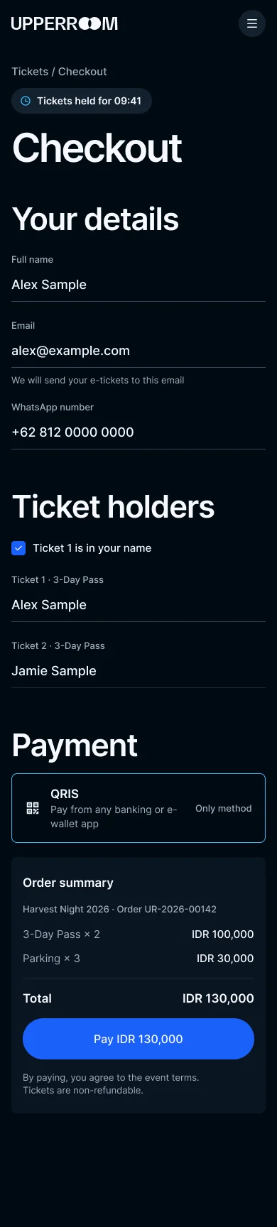
Pay with QRIS, walk in with a QR.
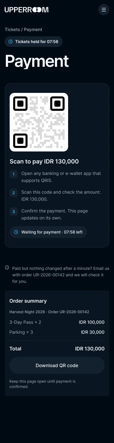
Guests pay by scanning a QRIS code with any banking or e-wallet app. Their tickets are held for ten minutes, while the guest completes the payment.
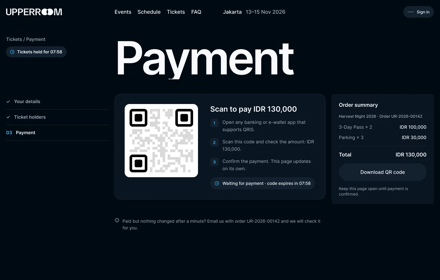
Payment
A ten-minute hold while the guest pays.
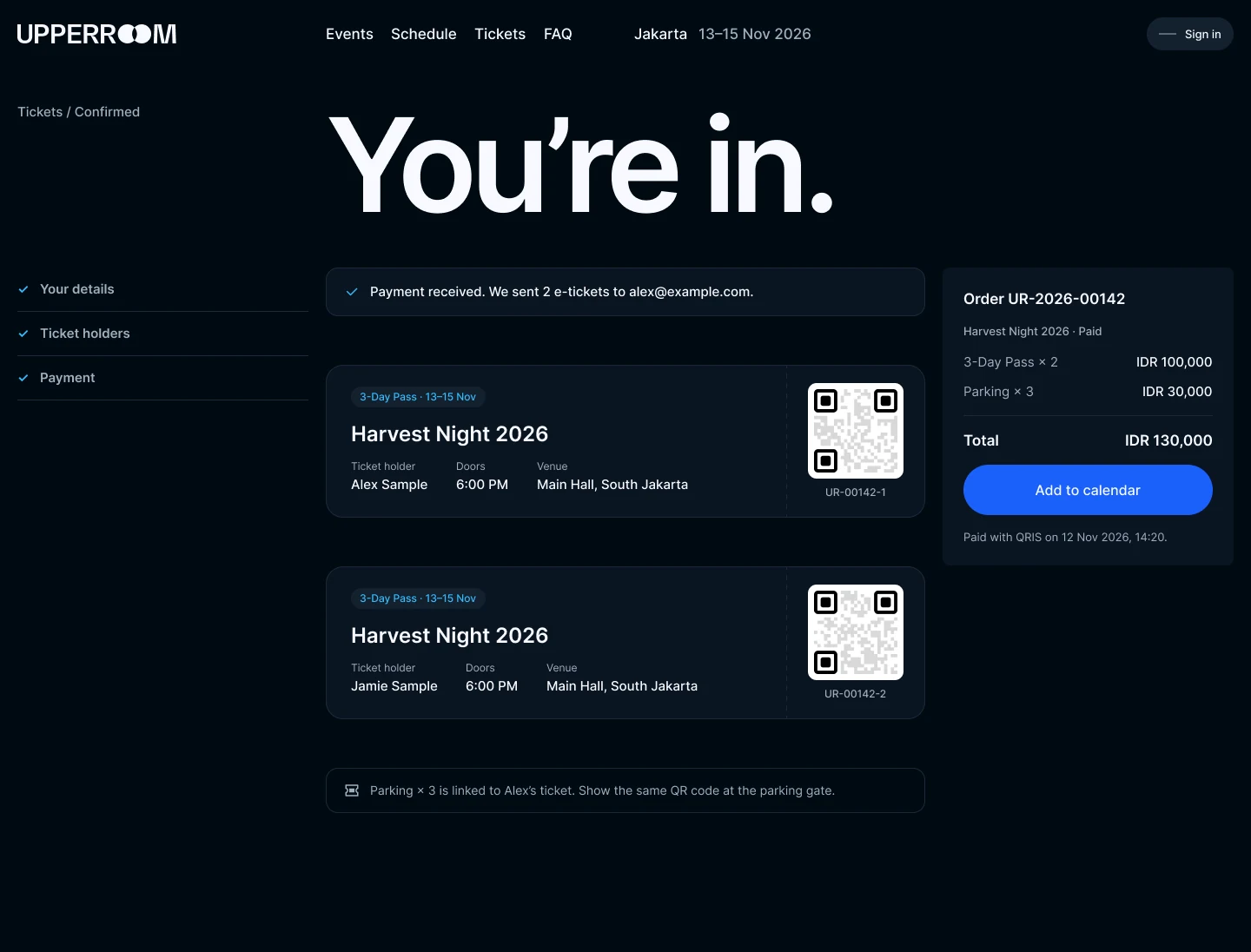
E-tickets
One QR per person, so friends can arrive on their own.
An account for the tickets you hold.
Sign in to see your tickets, transfer them to friends and follow the events you care about.
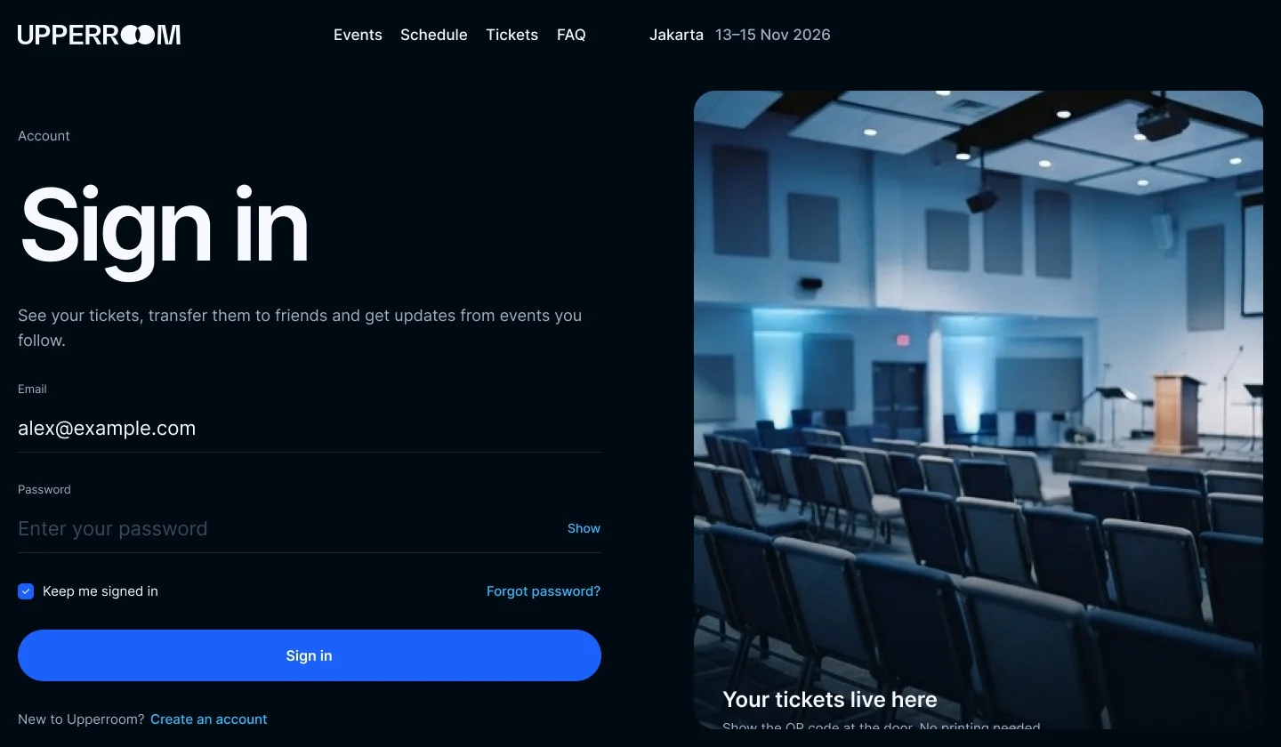
Sign in
Your tickets and the events you follow, in one place.
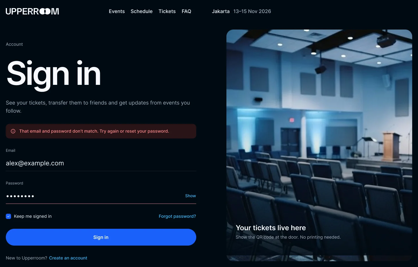
When it goes wrong
A clear message that says what to fix.
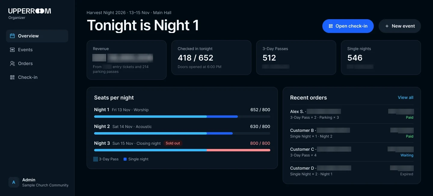
Organizer dashboard: how tonight is going.
The event team sees money in, seats left and who has arrived for each night, updated the moment a ticket is paid or scanned.
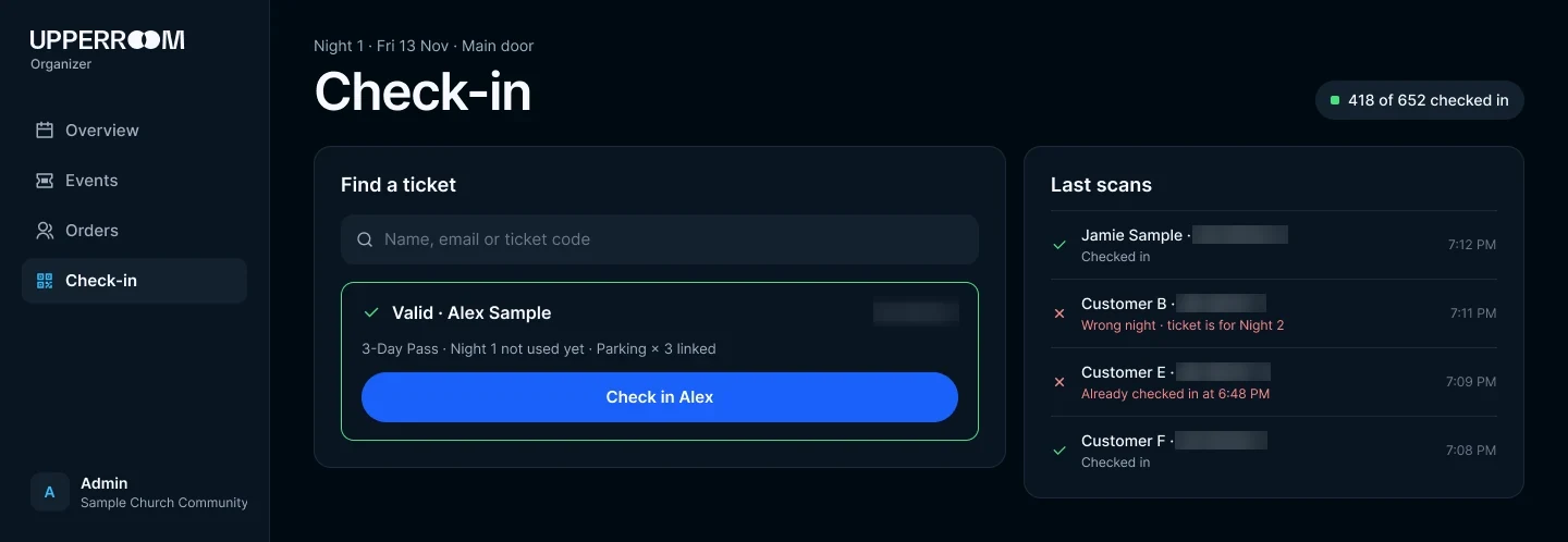
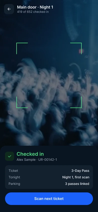
Check-in at the door
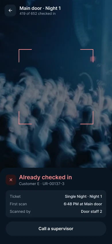
Volunteers scan tickets with their own phones. If a ticket is not valid, the screen shows the reason: wrong night or already used.
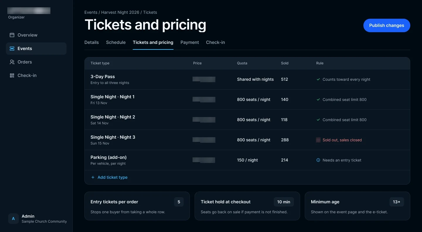
Tickets and prices, set per night.
Before sales open, the organizer sets a price and a seat limit for each night and for the 3-day pass. The website and the door both follow these rules.
Phone first, on both sides of the door.
Guests show the QR on their phone, and volunteers scan it with theirs.
The Result
One mark of two overlapping rooms now runs through the event page, checkout, organizer view and scanner, so the brand feels like the same room from a group chat to the door.
Guests see the price before anything else and leave checkout with a named QR for everyone in their group. Volunteers scan from their own phones, and every answer on screen tells them what to do next.
The team follows money and seats live instead of matching bank transfers after the weekend.
-
Discovery
- Organizer interviews
- Event-night walkthrough
- Volunteer interviews
-
Brand & UX Design
- Logomark
- Logotype and lockup
- Site map
- Ticket flow
- Wireframe
-
UI Design
- Colour and typography
- Brand guidelines
- Design system
- Responsive
-
Prototyping
- Interactive prototype
- QR scanner
-
Development
- Event website
- Ticketing and e-commerce
- QRIS payment system
- Organizer dashboard
- QR scan
- QA, launch and ops